Ludum Dare 46 Post Mortem: Across the Lake


Across the Lake Post Mortem
Summary
A cozy, chill game about a stone skipping across a lake. Made for Ludum Dare 46, from April 17th-April 20th.
Game credits
- game: Stephan Steinbach (https://twitter.com/stephan_gfx)
- art: Morgan McGuire (https://twitter.com/casualeffects)
- sound: Steve Lavietes (https://twitter.com/stevelavietes)
- physics/feel: Forrester Cole (https://twitter.com/forrestercole)
Release Summary
Ludum Dare Page: https://ldjam.com/events/ludum-dare/46/$199342/
Itch.io Page: https://stephan-gfx.itch.io/across-the-lake
Open Source Code: https://github.com/morgan3d/quadplay/tree/master/games/across_the_lake
Gameplay Gif
Code Statistics
~200 git commits
Approximate lines of code:
60 GameOver.pyxl
23 Play.pyxl
30 Title.pyxl
8 camera.pyxl
299 draw.pyxl
174 skippy.pyxl
176 ui.pyxl
770 total
In-engine breakdown vs. fantasy console limitations:
Runtime performance breakdown:
Background
Project Goals
- See how well the quadplay engine does for a compressed jam like ludum dare
- Finish, polish and ship a really simple idea
- Make something relaxing and chill
- Don’t disrupt other life obligations
Personal Goals (stephan)
- Work with a team (don’t do it alone)
- See how an idea can come from a simple prompt and kept to a tight scope and finished in a short time
Inspirations (Morgan)
- Alto’s Adventure
- Inside
- Far: Lone Sails
- Canabalt
- Bob Ross
- Sekiro
Pitch
Development
If you look at the timestamp above, by 9pm that day (3 hours later), Morgan had posted this:
Followed soon after we had this:
This was a promising start!
Reflections and a ground plane, actual rock sprite, and a splash makes it really come alive. We added a counter for how far the player had gotten as well, debating about whether skip counting or distance travelled was more interesting to the player.
It turns out that the international stone skipping community (which is apparently a thing: http://news.bbc.co.uk/2/hi/uk_news/scotland/4280078.stm) also has events that count number of skips and distance (according to a possibly out of date wikipedia article). So we included both.
It is probably hard to tell in just a gif, but in parallel with the look coming together we spent a lot of time tuning the bouncing physics and the feel of the stone flying. Given the tight scope, we didn’t have a ton of features to implement and so had time to make those things feel better.
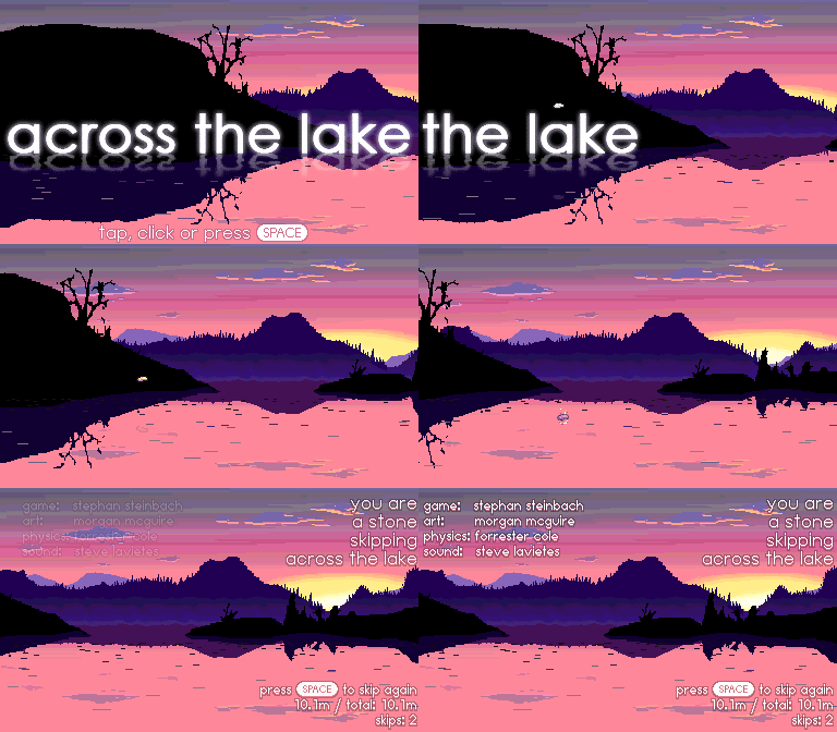
First version of the title + game over screen, with the full game loop intact. This was captured on Sunday, April 19th at 11:28, so we were feeling really good about being able to complete the project.
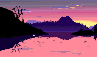
Final gif submitted to itch.io.
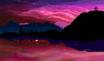
Mid-game visuals
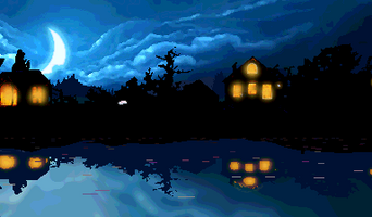
Night time environment for later in the game.
Visual Style
It was very fun for me (Morgan) to be a visual artist instead of primarily a programmer or designer for a game. I worked from Stephan’s music-to-work-by play list to try and find visuals that fit the chill but upbeat tone.
I started with a Google Chrome theme of all things for the initial palette and composition as reference art, and scribbled a few layers in Photoshop and then animated them with parallax.
To make a visual journey, I took three layers of background parallax plus a skybox and hooked them up to generate different large incoming sprites based on which area of the game world the player was in. I designed the backgrounds so that they would crossfade without too much ghosting and made a simple color script: pink -> purple -> cyan.
The speed of the stone was hard to judge, so I used a classic space-game trick: put some junk streaking past. This is basically Star Trek warp lines but in 2D parallax. These read as waves or leaves visually. With the parallax they give a great sense of depth and speed. When the camera is not moving I wiggle them by a cosine to make it look like the water isn’t stagnant.
The stone’s reflection is just the stone drawn upside down, faded to the average sky color (which I read from a corner pixel) for “lighting” and with lower opacity as the stone gets higher above the water.
I had originally planned to make the background layers a curve based on layered octaves of noise with some sprites on top for trees. It turned out to be so much faster and easier to control to just draw giant sprites that I did that.
I borrowed heavily from LIMBO and other games that use shadows and minimal lighting to imply detail through silhouettes. I’m not a very strong artist and this allowed me to create a reasonable amount of content in a day. I was also toying with the idea of visuals in the background that would tell more of a story--maybe going into the city, and then the downfall of the city, following the arc of the Thomas Cole Eden to Empire series of paintings. That clearly became way out of scope and we liked ending in a cozy area with lit up cabins and full trees (the game goes from bare trees at sunset to more lively areas later on), so I dropped this idea.
Almost everything is drawn in Photoshop using a 1-pixel brush, except for some of the more epic clouds which are manipulated and degraded photos with the airbrush tool used on top.
The splash is more-or-less a single sprite that just gets stretched and faded a lot, and chopped up into pieces. It was a placeholder for a better particle system solution and turned out to look good enough that it wasn’t worth revisiting.
Reflections
Workflow
- We were able to make this game while maintaining a pretty good balance of general weekend life stuff
- We took breaks and were clear about when we were taking breaks
- We all understood that this project was being done in the gaps of normal life
- Everyone picked an area (sound, design, physics, art) and mostly stayed in their area, taking and giving feedback but also just kind of jamming (in the music sense).
- When someone did something neat, we all bent our areas to that new melody and followed along.
- Not a lot of planning and debate, but just organic improvisation in good faith let us move really fast and the ideas blossom
- Also on the improv note, it was great to have a team where (possibly because we were all busy and somewhat experienced) folks were mutually comfortable both with adopting suggestions and also with considering and then rejecting them. We trusted each other within our ad hoc chosen areas for the project and everyone was really supportive of each other and cheering the group on, which would have made this a net positive experience even if the game didn’t work out very well.
- A key improv idea is to try to say “yes, and…” instead of “no” when an idea doesn’t click for you. We did that a lot implicitly, and it always led us to a better place. Usually we didn’t reject ideas outright but riffed on them until everyone was more excited about the result than our differing original starting suggestions.
- Rapid iteration really helped; we could just show each other what we meant in sound/pictures/code, rather than having to rely on descriptions alone.
- Having a tight scope from the start and sticking to it did indeed let us focus on shipping and polishing that super simple idea
- The idea was so simple and focused that we didn’t need a design doc.
- We maintained a TODO list in a shared file in the git repo to roughly track ideas and what everyone was working on, broken down by person
- There’s a lot of wisdom and jokes about cutting scope up front, but this was literally the simplest possible scope (and for a four-person team!), which led to the best turnaround Morgan has ever had on a jam game, as well as the least stress and the most polish. I’ll set my sights very low in the future again
- We focused a lot on tone, starting with a bunch of reference art, a shared music-to-work-to playlist, and fonts. We had a shared vision for the mood of the game from the very beginning, even though we didn’t have any articulated vision for the game design. I wonder if this kind of focus on the emotional experience over the technical aspects would work for a more ambitious game
- The fancy title screen grew out of making an icon and needing large letters relative to the text. Morgan drew something that looked like a 64x64 motivational poster using a ridiculous script font and Stephan’s indie-proof original title, “You are a stone skipping across a lake”. The need to make the text readable caused us to iterate down to “across a lake”, which we liked as original sounding and goal-directed, but not too precious. We liked the icon so much that we decided to make the game title itself look like that, with proportionally huge letters
- It was satisfying to make something so polished in such a short amount of time
- We created a channel on slack so that friends from the quadplay community could follow along. This worked really well!
- HAVING a (albeit very small) quadplay community meant it wasn’t too difficult to find people who were interested in participating.
- Using slack notifications also meant it was pretty easy to follow along when other people had issues or updates.
- I don’t think people were stuck or blocked for too long.
- Quadplay making it super easy to record gifs was AWESOME for sharing on slack and giving feedback, reporting bugs, etc. We used the GIF and screenshot functionality constantly. The above progress images were all harvested from those sources.
- Although we were taking on different roles, everyone was a very experienced programmer. This meant that we were all comfortable jumping into each other’s code and modifying it in a pinch, which allowed us to just try things and show them off when we had different ideas instead of discussing or scoping them first
- We were mostly working on Mac laptops, but using different browsers, editors, and tools. It was handy having a cross-platform engine because we effectively tested a lot of scenarios
- The art all grew from this image https://www.themebeta.com/chrome/theme/1295890 used as inspiration, and straight up Bob Ross style “lake painting” strategies
- We had a game after about 45 minutes of work spread over two people and a few hours (while parenting in a pandemic). After that it was a matter of iterating and adding more folks in. Having a working prototype nearly instantly really helped, and setting the goal as simple as possible allowed us to have very little pressure and a lot of room for polish
- Having pushed “beat the gobblins” out to itch.io meant that we had scripts handy for building for itch. If you’re wanting to do a game jam, it really helps to have gone through the publishing process before the jam and gotten that smooth so that you’re not trying to set that up under time pressure, and figuring out what to upload where.
Platform (Quadplay)
- Quadplay was terrific for getting something running immediately and then iterating quickly. It is a gameplay-focused jam platform and did its thing well. Of course, we’ve all been sanding off the rough edges for two years, so it shouldn’t be surprising that it was a great tool for us this time.
- Quadplay was a nice mix of tools and constraints that let us build something visually cool looking and ship it to a ton of platforms in not a ton of code
- Jams by the alpha tester team are a good opportunity for flushing quadplay bugs and spotting missing features. This time:
- we found one entry that we wanted to rename for clarity in the API (the y_up flag...which turned out to be a bad idea to change in the middle of the jam because it broke compatibility)
- a weird performance problem on Safari that we optimized for a bit in the last hour.
- A few tiny and backwards compatible changes happened too, like making any_button_pressed() also sample touch input on mobile.
- There were very few changes to the platform this time around which was quite a change from previous jams. Quadplay is getting mature, and we could have run without changing anything if we hadn’t been the quadplay developers as well.
- There’s a lot of font and image support in quadplay and we leaned on that heavily.
- We’re overdrawing each pixel about 5x in a javascript software CPU renderer and everything has alpha blending, alpha testing, and color overrides on it. We’re also stretching and rotating sprites like crazy.
- There isn’t a lot of text in this game, but the built-in multiline, alignment, proportional fonts, shadows, outlines, button prompts, and multiple font variations all let us iterate extremely quickly. This is something that even non-retro game engines are not strong at and it is a key design feature of quadplay that helped here
- A danger of working on your own engine is that it can subvert the constraints-enforce-scope aspect of fantasy consoles, but we were pretty disciplined and tried to work with what we had. We were over the virtual limits on spritesheet sizes and pulled back to them at the end, which was a fortunate constraint: it improved the semi-procedural backgrounds and may have given a bit of a performance boost.
- The massive upside of web development is that games can be played nearly anywhere, by anyone. That’s great for deployment and easy testing and iteration. The downside is that it is a hugely fragmented base. Those Safari performance issues had never previously come up, and may have been from a recent Safari build or specific to certain devices. We also had trouble going full-screen on iOS with code that was fine on Android. That kind of thing always happens with the web and it makes it hard to control the player experience precisely.
- This was the first time that anyone really used the built-IDE heavily instead of external editors in “pro” mode. It is definitely usable, although some newer features were unstable from working at top of the quadplay tree vs. the stable public build. We may be at the point where a whole jam could be done in the IDE.
- The 384x224 resolution and 4:4:4:4 color really proved itself for iterating quickly on art. It was low-fi enough to move quickly because the constraints created a visual abstraction that prevented needing too much detail, but it was high-fi enough to make something pretty and not blatantly retro. This really was an art sweet spot.
- The bare-bones quadplay audio API showed its limits. This is one area that previously had not gotten much use, so we didn’t know which way to push it yet. There’s now some good examples of features that would be helpful for audio.
- It is very ironic that recent quadplay features we worked hard on were 8-button controller support, AI pathfinding, and full 2D physics...and we made a 1-button game with hardcoded physics and one character, who is literally a non-interactive rock.
- Quadplay has a ton of built-in fonts (we made two more, but could have shipped without them). It also has a good selection of sprites for prototyping. There are 100 sound effects and about 30 songs, but when it comes to audio, that’s a pretty small selection. We didn’t use any of the built-in effects or music, even in early drafts. This is another area where having something like sfxr built in or just a larger library of effects and music would be helpful, we need to get community support somehow--opengameart.org and Morgan’s own drawing created a lot of art, but freesound.org and similar are limited in appropriate (legally and aesthetically) sounds for a fantasy console
Development Notes for the Future
- Debug Constants
- We added a debug constant to the game for testing that made the stone skip perfectly.
- This was super useful but we had to keep remembering to turn it off before committing
- … and it was accidentally pushed to one of the release builds.
- It would be nice to have session-state specific settings for variables like that, or a git script that checks its state or something before checking in (another good reminder to push early and not leave it to the last minute)
- We’re old-school and were happy to use debug_printf [and debug_watch] for most of our debugging, but this is a problem when the debug stream has four different people’s debug statements interlaced. It would be good to have a simple API for per-developer debug print toggling, just like quadplay has a master checkbutton for hiding all debug prints. I guess you can build this yourself: def debug_steve(...args): if DEBUG_STEVE: debug_print(...args) is a one line function to set up, and can be controlled by quadplay’s game “constants”, which are checkboxes that can be toggled while the game is running.
- A few quadplay features haven’t shipped yet that might have helped a bit. The built-in global camera API is not ready for deployment, so we hacked our own. The in-IDE sprite editor doesn’t exist, so we used Photoshop. If the binary exporters were complete then we might have shipped binaries--although the web version runs on the same platforms, so this would mostly have been useful for mobile app stores, not desktop.
- Stephan: Laying out UI takes a lot of time, I feel like I don’t have good patterns for quickly getting things working.
- borrowing the camera pattern from Beat the Gobblins did make it easy to integrate with the camera motion.
- To make sure things line up, I would take screen shots into a image editing app and use the rulers to figure out how far off I was
- … but the screenshots were higher res than the screen space so it required a bit of interpretation.
- Deploying builds for playtesting
- One thing from Beat the Gobblins that was super handy was the `make deploy` build target.
- This would push to a dummy github repo for REALLY quick turnaround on playtesting builds.
- Because we were modifying the quadplay engine itself (the y-up change) we couldn’t do this during the jam, so to test out the build we had to go out to itch.
- That was slower, and I wish we could have had the more easy make-deploy for testing and playtesting.
- Sound API
- Would be nice to have some more structure around “variations” for dealing with families of sounds.
- In our case we had 5 splashes and wanted to pick one randomly, ended up having to group and structure them in code.
- We talked about having layers of music that come and go, but quadplay didn’t have a way to tell when one sound finishes to start the next one at the time (we’ve added this since!)
Files
Across the Lake
you are a rock skipping across the lake
| Status | Released |
| Authors | stephan_gfx, CasualEffects |
| Genre | Action |
| Tags | 2D, Arcade, Atmospheric, chill, Cozy, Ludum Dare, Ludum Dare 46, Pixel Art, Procedural Generation, Short |
| Accessibility | One button |
More posts
- Ludum Dare 46 - Approaching the finish lineApr 20, 2020
Leave a comment
Log in with itch.io to leave a comment.